There’s no such thing as a perfect font. Only a perfect fit.
Over the past couple weeks I built a website for an old rocker whose website needed to be brought up to date. Lots of blues, rock, and gospel makes up his forty-year long repertoire. He sings about “cruising,” wooing “gals” and picking up “chicks,” all while integrating an inordinate amount of self-deprecating Dutch and Calvinist jokes along the way. He’s a really talented guy, who still seems so young even as he enters his fifth decade on stage. Check out some of Glenn’s videos and you also can see the rough draft of the site I describe in this post.
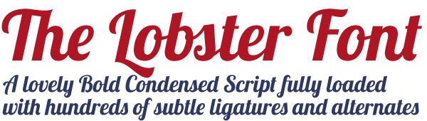
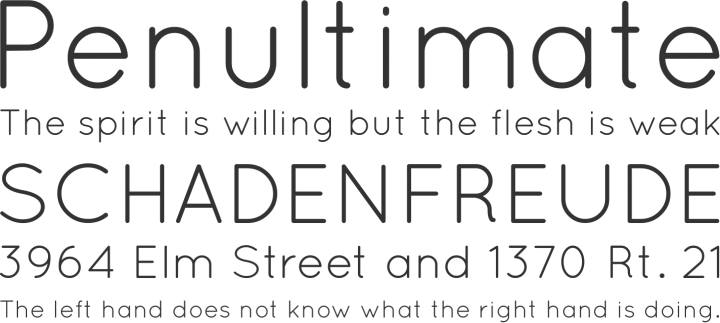
When I came across Lobster, I thought I’d never use it. I’m more of a Georgia guy. But for Glenn’s years of rockin’, what would be better than a little Rock Lobster? It reminds me of drinking Coca-Cola from a glass bottle or the brush fonts used on race cars—it reminds me of a time I never lived through. As Lobster is such a rounded font, I paired with Quicksand, a san-serif typeface without any cut-off edges. I thought the pair would balance one another as they both bopped around his site, one with a retro feel and one with modern style.
So we met yesterday, and he didn’t really like Lobster. He said it felt a bit “dated.” Initially I thought, yeah that’s the point. For a guy who’s played the same music for years, I assumed dated would be the idea. Then, seeing how playful he was in his old posters, I figured we could go out on a limb and use a font like Lobster, which is a mixture of cool and campy.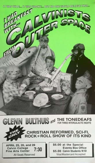
But now I see another way to take things: classic. He mentioned that he’s “more of a New York Times … or whatever they call it” kind of guy. Times New Roman? As a recovering academic, the phrase “12pt double-spaced Times New Roman” still makes me cringe. But I see what he’s getting at.
Glenn’s site (view my rough sketch here) serves as his biography. It’s a memorial to all the fun he’s had bringing joy and music to others throughout the years. Back in his goofball years, Lobster would’ve been a good fit. But now age gives him an unmistakable, and natural, gravitas . He’s still as laid-back and funny as ever, but to miss the venerable element of his life and work is to not look at them at all.
It doesn’t have to be Times New Roman. Anything with serifs and various stroke weights will add some calligraphic dimensionality which reflects the multi-faceted guy I’m trying to portray online. In any case, it might be Times New Roman and that’s fine. After all, there’s no such thing as a perfect font. Only a perfect fit.


")
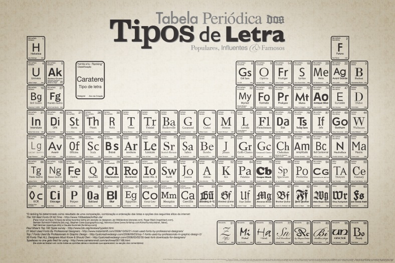
For more on some of the most influential and diverse typefaces in history, check out John Waters’ Fifty Type Faces That Changed The World (Design Museum). It’s helped me learn about the different personalities evoked by a typeface’s form.
